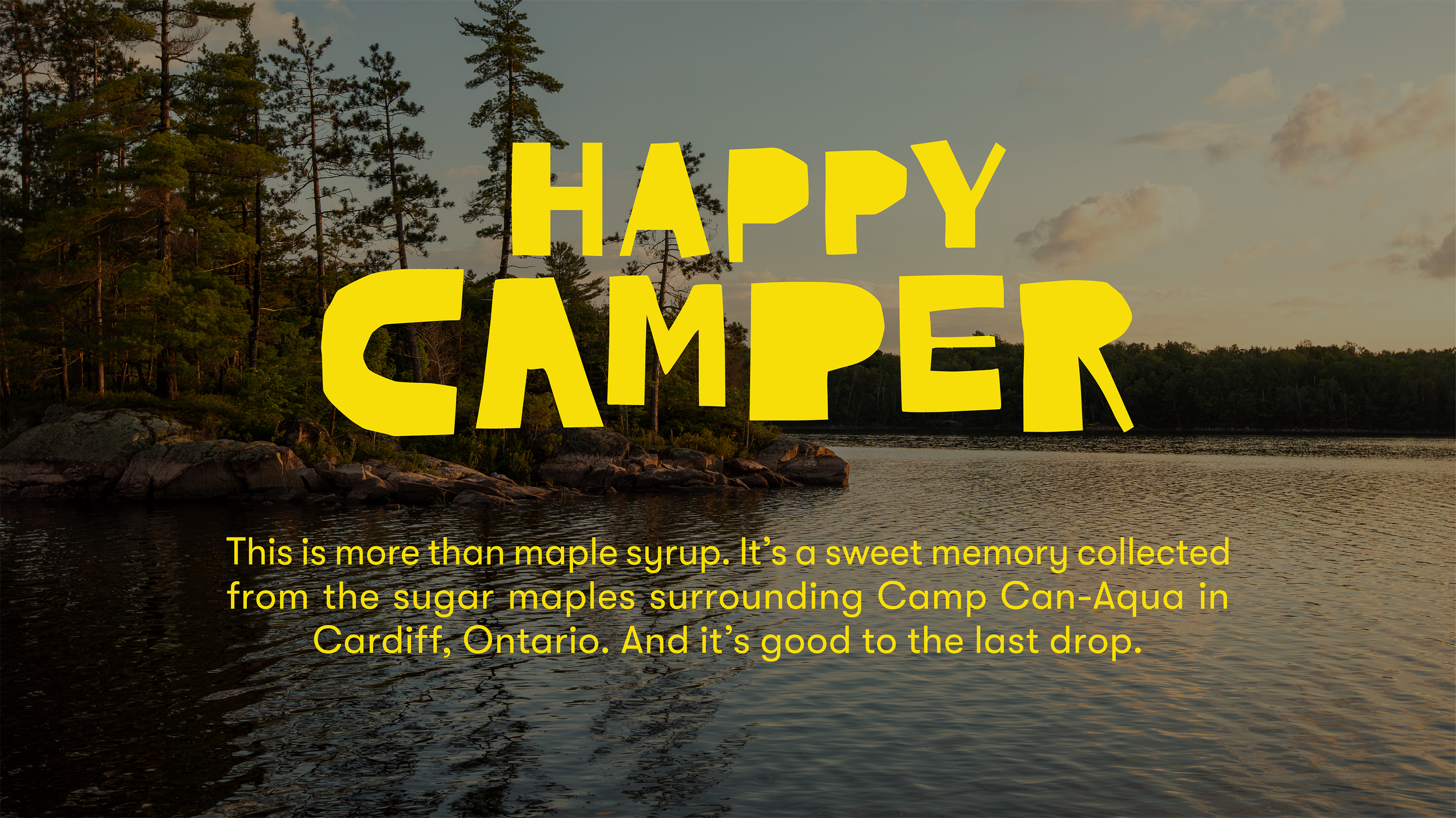


Happy Camper
Naming + Packaging
To build a strong brand identity, we focused on the unique qualities of this maple syrup: it's 100% Canadian, supports young people by donating $1.00 from each sale to send kids to camp, and is deeply connected to the camp experience, as it’s sourced from maples surrounding a camp.
We chose a name that reflects these characteristics—Happy Camper. It captures the essence of this syrup, ensuring that whether you’re a child or a customer, enjoying it makes you one Happy Camper.
The playful logo, designed in a cut-out style, evokes the spirit of camp, while a series of illustrations on the bottle bring to life the outdoor adventures that shape its flavour profile.
Agency: The&Partnership
Illustrator: Hai Nguyen
Writer: Jordan Mark


